October 28, 2019
Why making an ad 1% better changes everything (and how to do it)

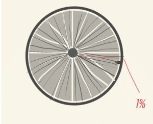
Habits have become trendy nowadays, in self-help, pop psychology, and advertising. Much of this is based on the “1% rule,” the idea that small improvements, consistently applied, lead to exponential gains. Take the example of British cycling, which in 2003 was so terrible that a bicycle manufacturer refused to sell bikes to them, for fear of looking like a failure by association.
Dave Brailsford, an MBA, was hired to change that. Everything about British cycling was broken down into the smallest chunks: from the air pressure in the tires, to the alcohol used on the handle grips, to the mattresses the athletes rested on at night. One change led to another, and by 2008, the British cycling program was the best in the world.
There’s always room for improvement, especially in ad performance. Here are five techniques we use to continually evolve, optimize, and learn.
IDENTIFY THE CORE MESSAGE
What is the one-sentence summary of what people get from the ad? Talk to people in your target demographic and ask them what their key takeaway was. The gap between intention and what was actually communicated can be surprising! If the message is getting lost, start your next revision by literally saying the right message in narration or onscreen title, and see if it moves the needle. If it’s working, start cutting things that aren’t the message and see what happens.
LABEL THE PARTS
Go atomic. Don’t just consider the dialogue, note the narrator’s inflection, the syllable count, the length of the pauses, and the exact distance of a given line from the last mention of the product. Don’t just watch the scenes, watch them with the sound off, watch lying horizontally on a couch, count many times the actor has their eyes closed in each of the frames they appear onscreen for. Make a list of everything: what’s the temperature of the lighting? What are the exact Pantone colors of your hero images? Advertising works because people have abstract, emotional ties to imagery, and sometimes even color correcting the hero bike from orange to vermillion can actually change the association people have with the spot.
MINE DATA FROM THE VARIATIONS
If the 30 is outperforming the 15, try a recut 15 focused on a different vignette (or that scraps the original concept or story entirely, and just uses it as a visual backdrop for saying value props). If the 15 outperforms the 30, try a 30-second version with just the 15 copy and (gasp!) more silence, a heretical concept to most CMO’s, but when you’re selling, less is often more.
ACT LIKE A SCIENTIST
Write a list of the questions you’re dying to know about your brand. Do customers convert because of the problem you solve, or the aspirational nature of your imagery? Do discreet shots of products work better than humans interacting with product? Does music that was popular when your core demographic was in their teens and 20’s help you connect better? Next, work with your ad partner to devise variations to test your theories. Whether you’re wrong or right, the increased learnings improve the next cut, and save you time, money, and wasted experiments on every future revision.
TEST YOUR ASSUMPTIONS
A little knowledge can be a dangerous thing. Once you’ve tested, don’t fall into the trap of thinking that your axiom is the full truth. Just because the ad set in a kitchen outperforms the ad set in a living room, doesn’t mean that living room-related concepts are forever off-limits. The more you stress-test your assumptions, the more you learn about the actual drivers of performance, and the more you can incorporate a 360 degree understanding of data into future messaging, creative, and internal strategy.
